A good friend from OSU requested a painting. He didn’t really give me anything specific to work with so I had free range for topic/style/color palette/etc. That’s always fun, but also a little nerve-wracking because you don’t know what they’re necessarily going to like.
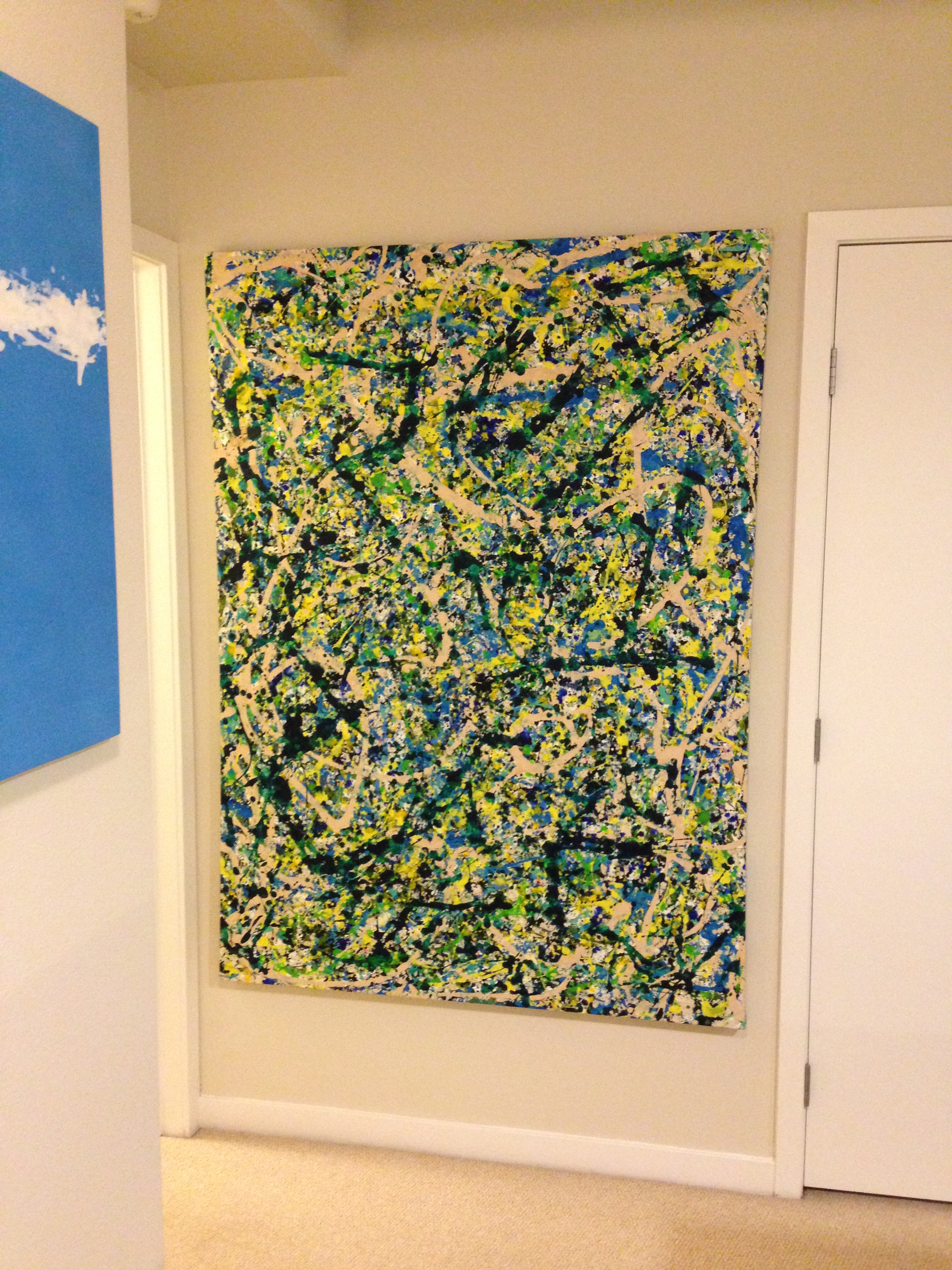
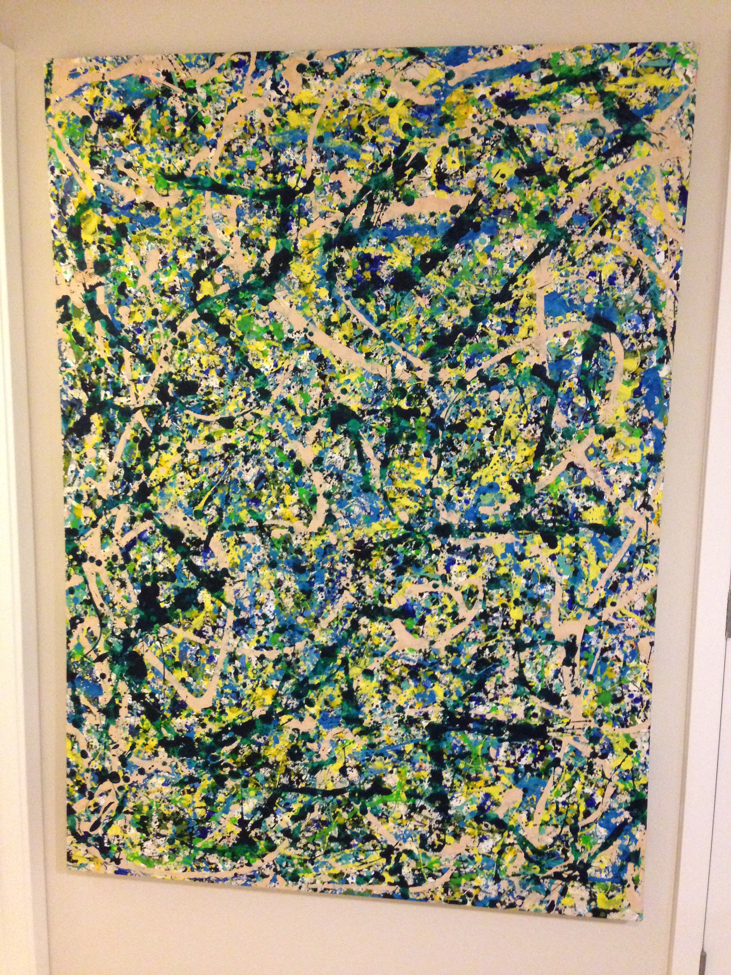
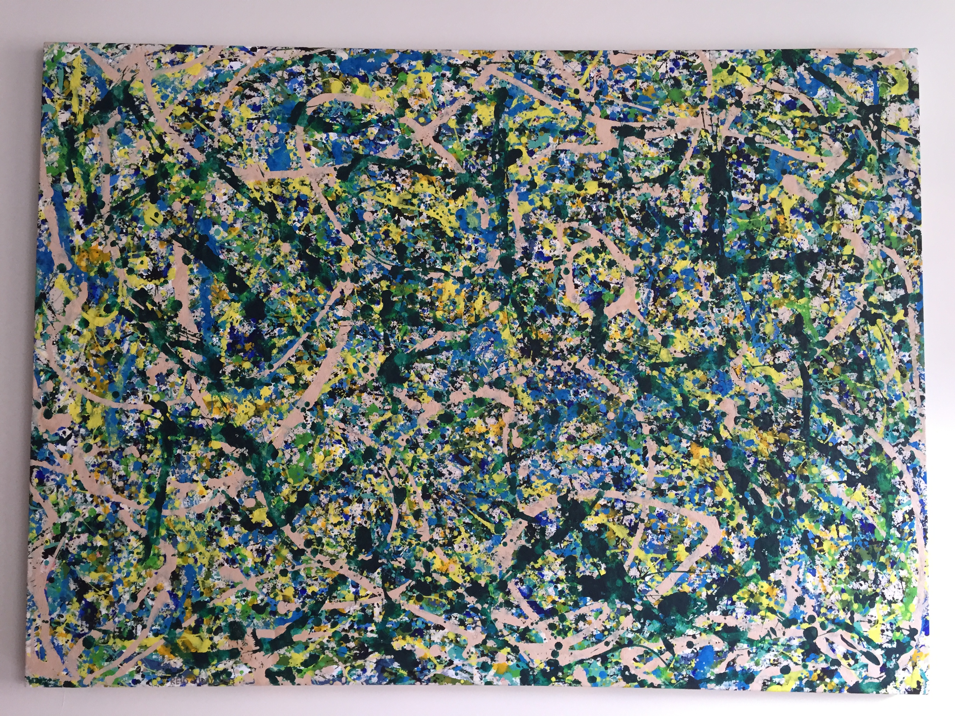 Gangsta (spring in Portland), 2013, 48 x 66 inches, acrylic on canvas
He lives in Portland, so I wanted to use a lot of greens and yellows and natural colors (the more I paint, the more I realize just how many of my paintings have this same color palette – paint what you love, I guess!). I wanted to keep a feeling of lightness, or birth, or something, so I tried to use bright, light colors.
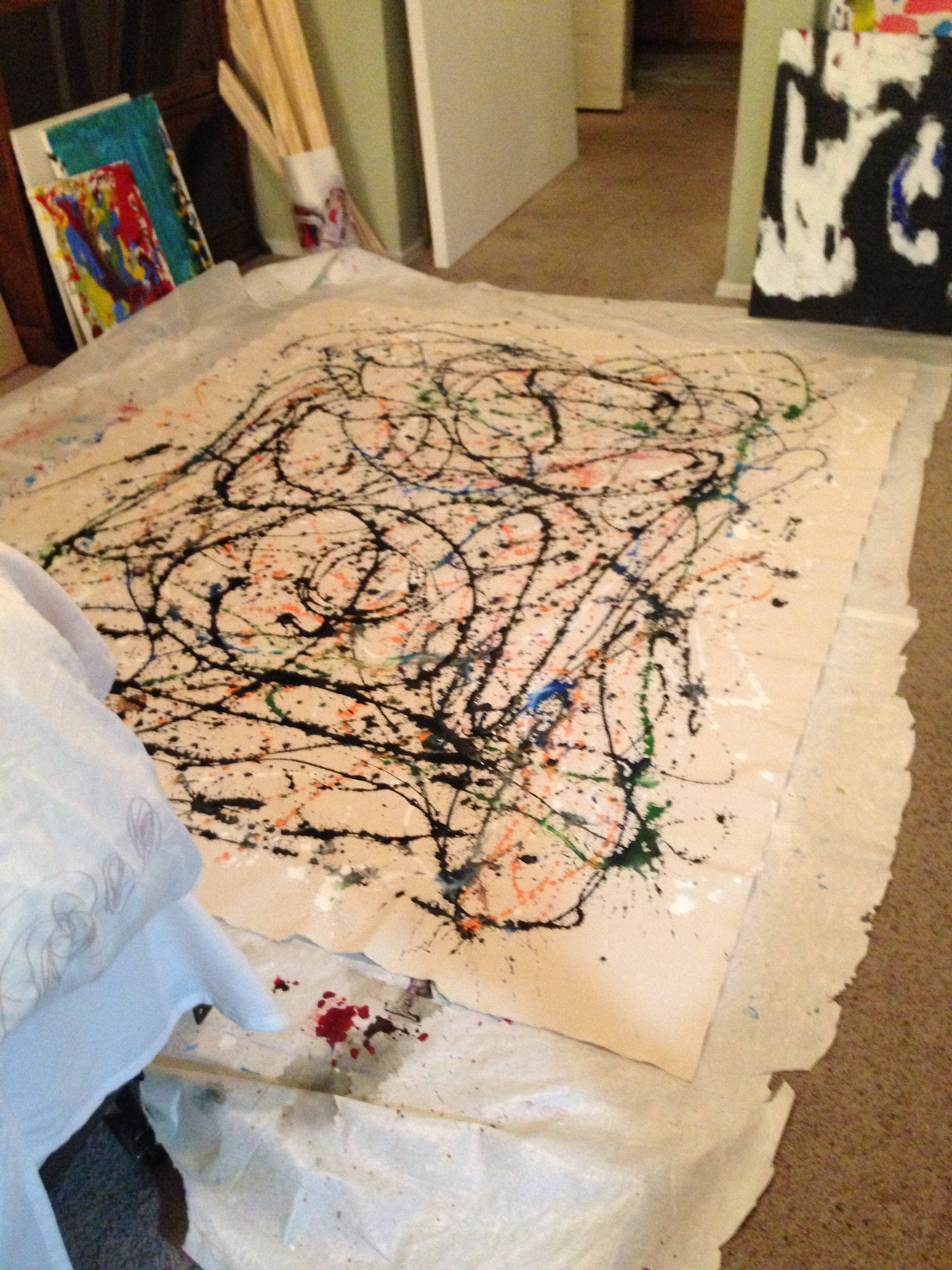
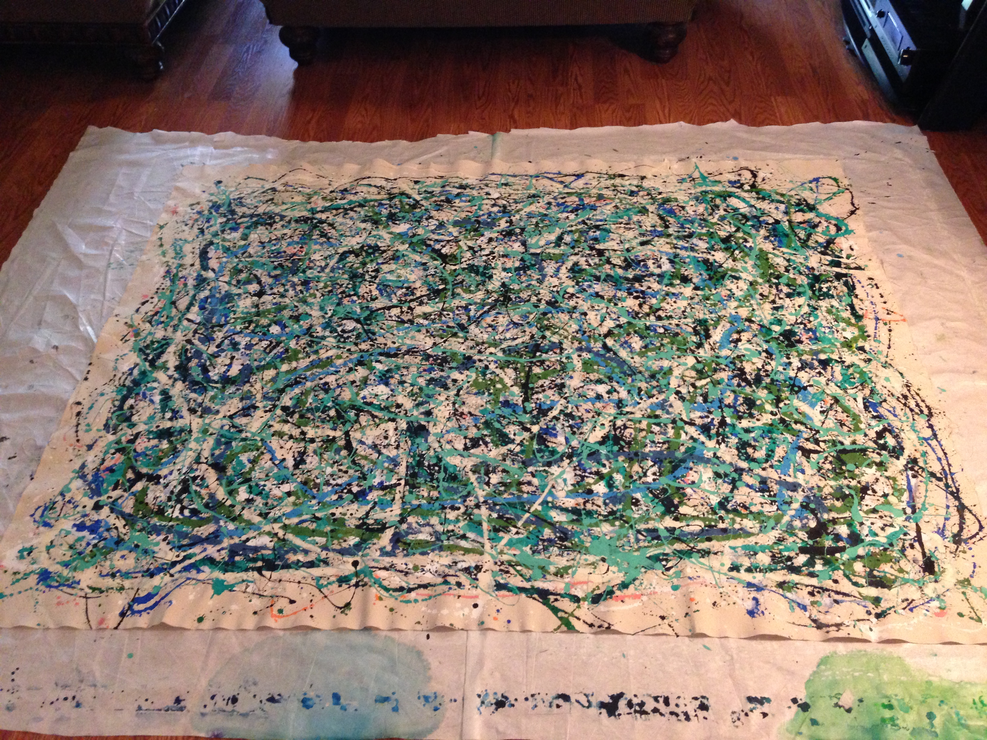
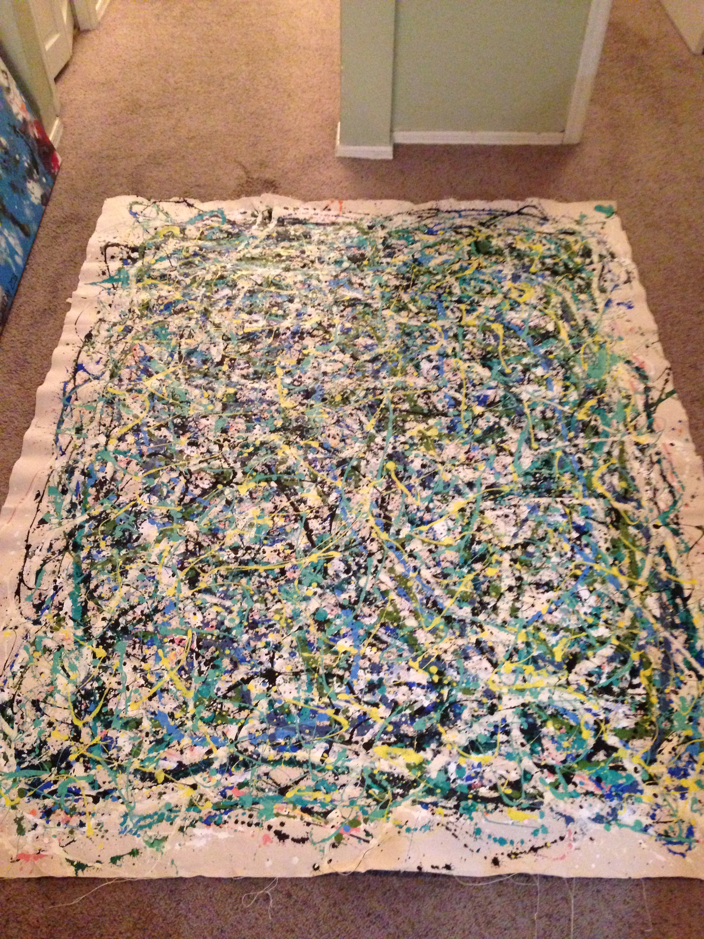
I had been studying Pollack and trying to understand what made his paintings interesting and revolutionary….and not just spilled paint. I realized that it was probably two main ideas: (i) the size – he painted these huge paintings that blow you away with their size and just physical presence (I once saw a small 24×24 inch drip painting he had done – it kind of sucked), and (ii) he always maintained a careful, delicate, purposeful balance between order and disorder. It is paint that was dripped, thrown, and splattered across the canvas, but there is an underlying order and purpose to them. You can ascertain distinct shapes and patterns that make their way out of the disorder and to me, that is what drives their beauty and complexity.
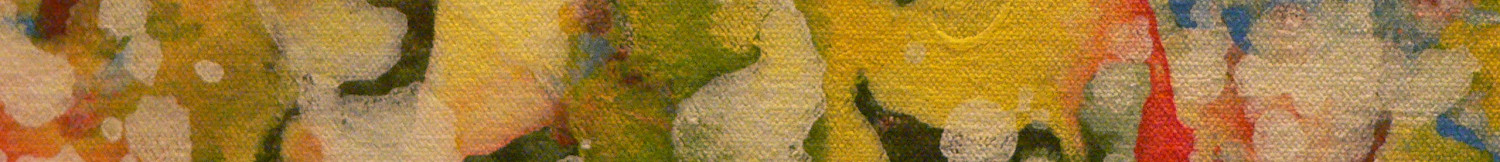
I also had recently bought the Tune-Yards album, W H O K I L L, and there is a song on it that I really love called Gangsta. It has a lot of similarities to that Pollack idea – of using loud, disordered sounds to create something harmonious and beautiful – something that demands attention! I picked out most of the colors and did the first few layers of the painting while listening to that song as loudly as possible (hence the title). For the first layers, I used some “non-sequitur” colors (pinks and oranges) that I would be almost completely covered by the time the painting was finished. It’s not really obvious in the final pictures, but there is a lot of variation in tone and color in the close-up, which adds to the general idea, in my mind. I used an opaque olive oil dispenser to drip paint onto the canvas to create the larger, thicker lines (the opaqueness means you can’t tell when the paint is coming out and leads to a lot more randomness and interesting patterns); an old brush to fling some layers down to create the smaller spots; and a spoon to delicately put paint exactly where I wanted to fine-tune the end product. For me it’s the hunter green and buff white that create the order and backbone of the painting, while the other colors and areas add energy and intrigue.
He hung it horizontally in his apartment, I had it hung vertically in mine (before finally getting it to him). Either way works, I think.
Some intermediate steps along the way: